September 27, 2017
by Bryce Coward, CFA in Markets, Portfolio Management
Indicators of market breadth are often useful in confirming or telegraphing important trend changes in equity markets. In simple terms, indicators of market breadth measure the level of participation of individual stocks in the general trend of the market. At bear market lows, almost all stocks have been going down and readings like the percent of stocks in up-trends and the percent of stocks making new lows hit extremes. At these junctures, an improvement in market breadth (read fewer stocks participating in the bear market) is often an early sign that the worst of the decline has past. Conversely, market breadth indicators often start to deteriorate ahead of important intermediate and long-term highs even as the general trend in the market still appears to be strong. Large divergences between market breadth and stock prices is an early warning sign to market participants that all may not be well underneath the surface.
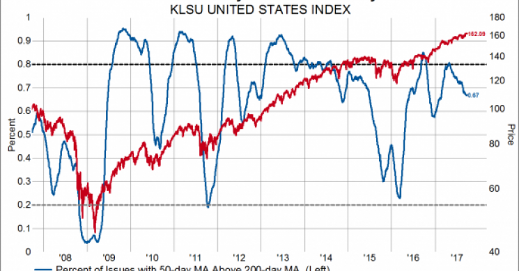
This brings us to the topic du jour, which is that we are taking note of an early deterioration in some of our most useful market breadth indicators even as the stock market continues to make new highs. That is to say, the stock indexes are making new highs, but the number of stocks participating in that trend is waning. In each of the charts below the market breadth indicator is marked by the blue line plotted on the left axis and the price level index is marked by the red line plotted on the right axis. For this post we’ll focus just on stocks in our United States index, which covers the largest 85% of companies and is a near replica of the MSCI USA index.
In this first chart we show the percent of stocks with their 50-day moving average price above their 200-day moving average price overlaid on the price level of our United States index. This is a blunt tool to measure the percent of stocks that are in an up-trend. As readers can see, our breadth indicator has been deteriorating for some time even as the overall market has been grinding higher. Similar patterns were seen before market declines in 2010, 2011. 2012 and 2015.

This next chart shows the net number advancing stocks over the last 200 days overlaid on the price level index. The number of net advancing stocks is simply the number of stocks trading higher now compared to 200 days ago minus the number of stocks trading lower now compared to 200 days ago. It peaked at the end of 2016 even as the market has marched higher so far through 2017. This indicator peaked before declines in 2010, 2011 and 2015.

Our third chart shows the percent of stocks with positive performance over the last 200 days overlaid on the price level index. With the market moving higher, we would expect a large and growing number of companies to be trading at a higher price now compared to 200 days ago, but we’re seeing the opposite, just as we did before the 2010, 2011, and 2015 declines.

The final chart shows the percent of stocks making new 65-day highs in price compared the price level index. Generally speaking, strong market trends are characterized by a large and/or growing number of stocks making new highs all the time. Since the end of 2016 the market has moved strongly higher, but the actual percent of stocks making new highs keeps declining. We saw a similar divergences in each of the major market declines over the last decade.

Negative divergences such as these can persist for long periods of time before the trend in the overall market changes and are just one aspect of a scenario that leads to a major downdraft in stocks. Combining signals from market breadth indicators with measures of economic momentum and valuations can oftentimes give investors a more holistic perspective of risks and opportunities. Currently, economic momentum (at least as measured by PMIs) may prove resilient in the near term as we highlighted here and here, but valuations as measured by a number of different indicators are high or even excessive. Therefore, the current situation of early divergences in market breadth and high valuations calls for careful stock picking and a relatively conservative asset allocation to help buffer a portfolio in the event of market turbulence. This may include allocating to stocks with less valuation risk (i.e. to areas that haven’t played this bull market), picking higher quality stocks, or picking stocks that have historically weathered declines far better than the average or median stock (this is different from just picking stocks with low beta, because beta can be deceiving). A more conservative asset allocation may include adding exposure to things like cash, government bonds or gold, or other assets with a zero or negative beta to the stock market.
Read more by MarketSlant Editor


